
| Exhibit A |
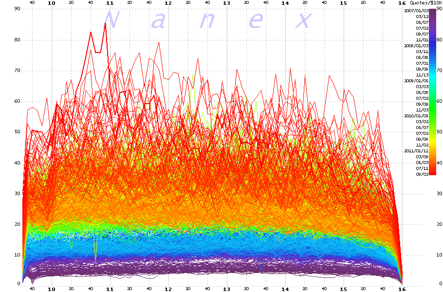
| The chart below shows how many quotes it takes to get $10,000 worth of stock traded in the U.S. for any point in time during the trading day over the last 4.5 years. Higher numbers indicate a less efficient market: it takes more information to transact the same dollar volume of trading.
Quote traffic, like spam, is virtually free for the sender, but not free to the recipient. The cost of storing, transmitting and analyzing data, increases much faster than the rate of growth: that is, doubling the amount of data will result in much more than a doubling of the cost. For example, a gigabit network card costs $100, while a 10 gigabit network card costs over $2,000. A gigabit switch, $200; a 10 gigabit switch, $10,000. This October, anyone processing CQS (stock quotes) will have to upgrade all their equipment from gigabit to 10 gigabit. Which would be fine if this was due to an increase in meaningful data.
This explosion of quote traffic relative to its economic value is accelerating. Data for September 14, 2011 is the thicker red line that snakes near the high. There is simply no justification for the type of quote data that underlies this growth. Only the computers spamming these bogus quotes benefit when they successfully trick other computers or humans into revealing information, or executing trades. This is not progress. Progress is almost always accompanied by an increase in efficiencies. This is completely backwards. And to anyone who might say:
we’d like to submit this paper as Exhibit A. We think that a 10-fold increase in costs without any benefits would be considered “detrimental” by most business people. We think the regulators would agree with us as well. In fact, they already have on this very topic: Section I.C.4 of Reg NMS (page 30) states:
And from the same document (page 410):
|
| 5-minute Average of the Number of Quotes per $10,000 in Trade Transactions. Time scale shows hour and minute of the trading day (9:30 to 16:00 Eastern). Each trading day between January 1, 2007 and September 14, 2011 is color coded by date: older dates are colored towards the violet end of the spectrum, while more recent dates are colored towards the red end of the spectrum. The most recent day is plotted as double thick red line. We had to process 535 billion quotes and 35 billion trades over 1,172 trading days to generate this chart. |
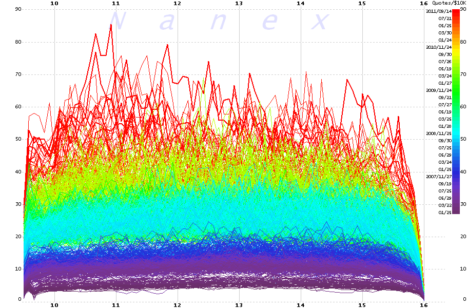
| Same data as image above, but plotted in reverse order |
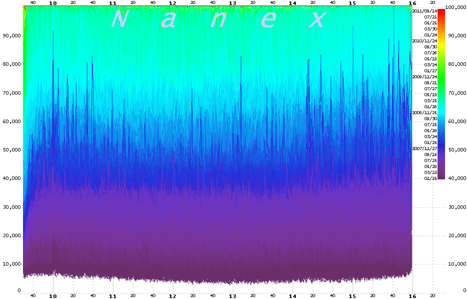
| 1-Second Peak U.S. Equity Quote Rate Showing a 100-fold Increase Since January 2007 |
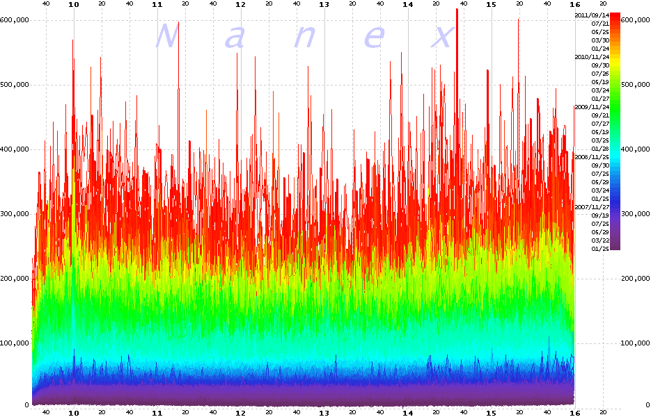
| Close-up of Chart Above |