
Nanex ~ 09-Oct-2012 ~ The Mini Knight
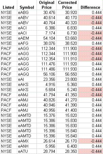
On October 9, 2012 between 10:02:20 and 11:01:15, there were at least 449 bad prints in 253 stocks (view in google docs, or download it) which caused price spikes on charts. All bad trade prints were from NqTRF (dark pools) and ended in 0.xx40 or 0.xx60. At the end of the day, 437 bad trades were corrected with new prices, and 12 trades were outright canceled. Almost all of the corrected trades have new prices that differ from the original price by $0.444 which is bizarre. Also puzzling, none of the new corrected prices are sub-penny prints, but all of the original bad prices were. Finally, trades that spiked higher had prices ending with the digit “4”, while trades that spiked lower had prices ending with the digit “6”.
Update: 11-Oct-2012 ~ Mystery Solved
It appears that an internalizer entered a price improvement offset of 0.444 instead of 0.004, because the bad trade prices closely track the NBBO, but are offset by that amount (see charts 5 and 6). From matching the bad trades to the NBBO, we’ve determined:
- Prices that spiked lower were from retail investor buy orders.
- Prices that spiked higher were from retail investor sell orders.
One of the first times we’ve ever seen the retail investor get a great deal! Sadly, it didn’t last, as the trades were either canceled or corrected with new prices (it is possible that the internalizer corrected the prices to clean up the tape, but let the retail investor keep the better price).
This raises a few important questions:
- Why did it take an hour for someone to find and correct this problem?
- What if a larger number were entered, such as 4.44? Is this how close Wall Street walks on the edge of disaster?
- The trades that originally were below the market were corrected to the National Best Ask prices (and the trades above, corrected to National Best Bid prices). Which means that the retail investor originally received a better price than the market – $0.444 per share better price. Why were these trades corrected (giving the investor a worse price) even though prices didn’t move outside of the clearly erroneous price bands?
- When we looked closely at some of the corrected prices, a few appear to have been corrected outside of the NBBO, meaning the investor received a penny worse than they should have! How were the corrected prices determined?
Here are a few of the corrections: (view all corrections in google docs, or downdoad it).
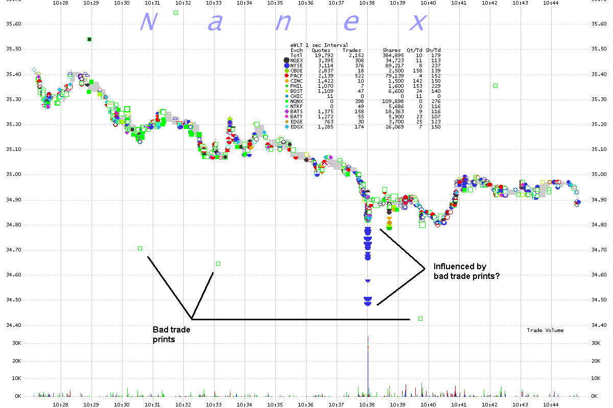
1. WLT 1 second interval chart showing trades color coded by exchange.
Was the sudden price drop on NYSE (blue dots) influenced by the bad trade prints?
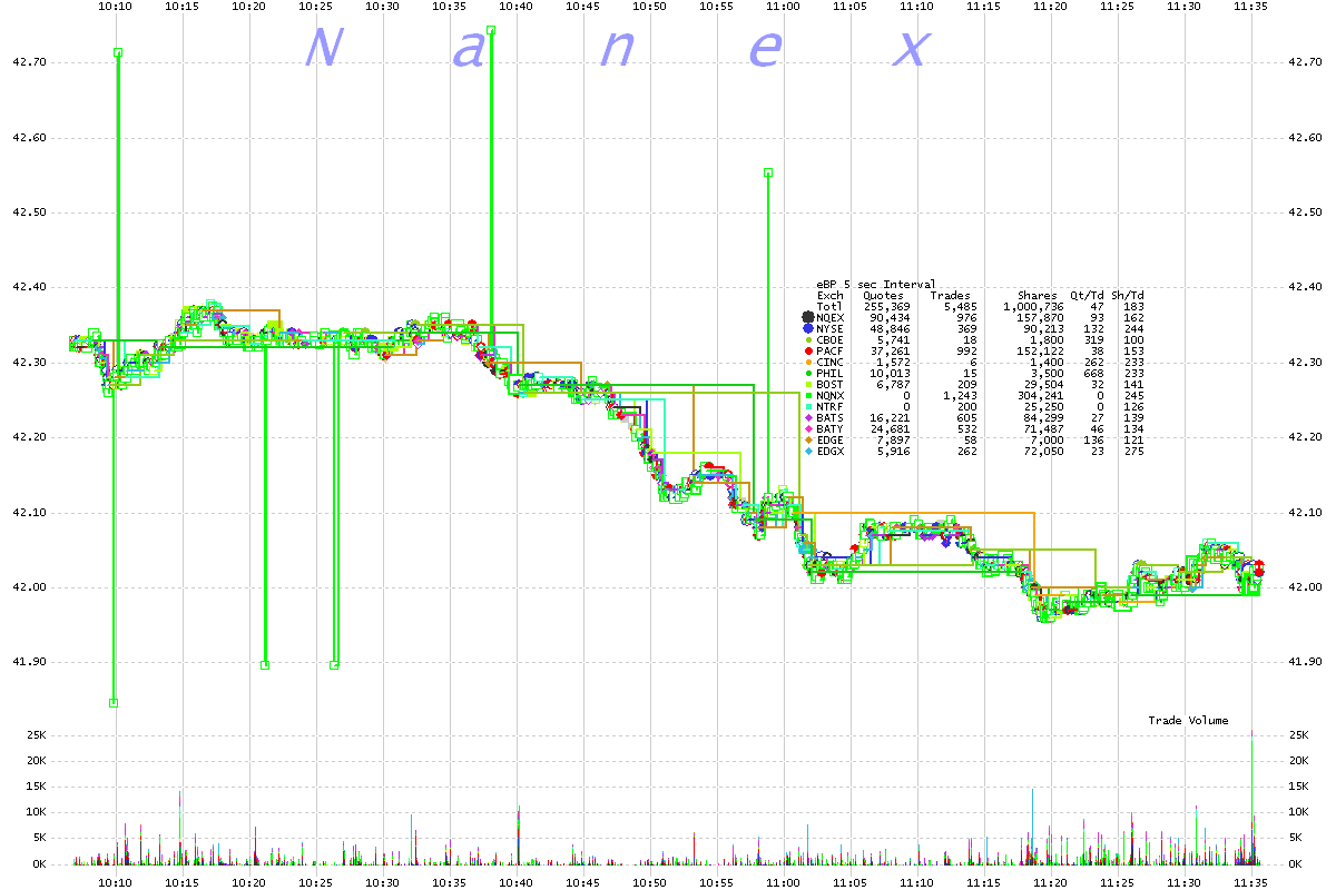
2. BP 5 second interval chart showing trades color coded by exchange.
We now know that the price spikes near the top were from retail sell orders, and the spikes near the bottom were retail buy orders.
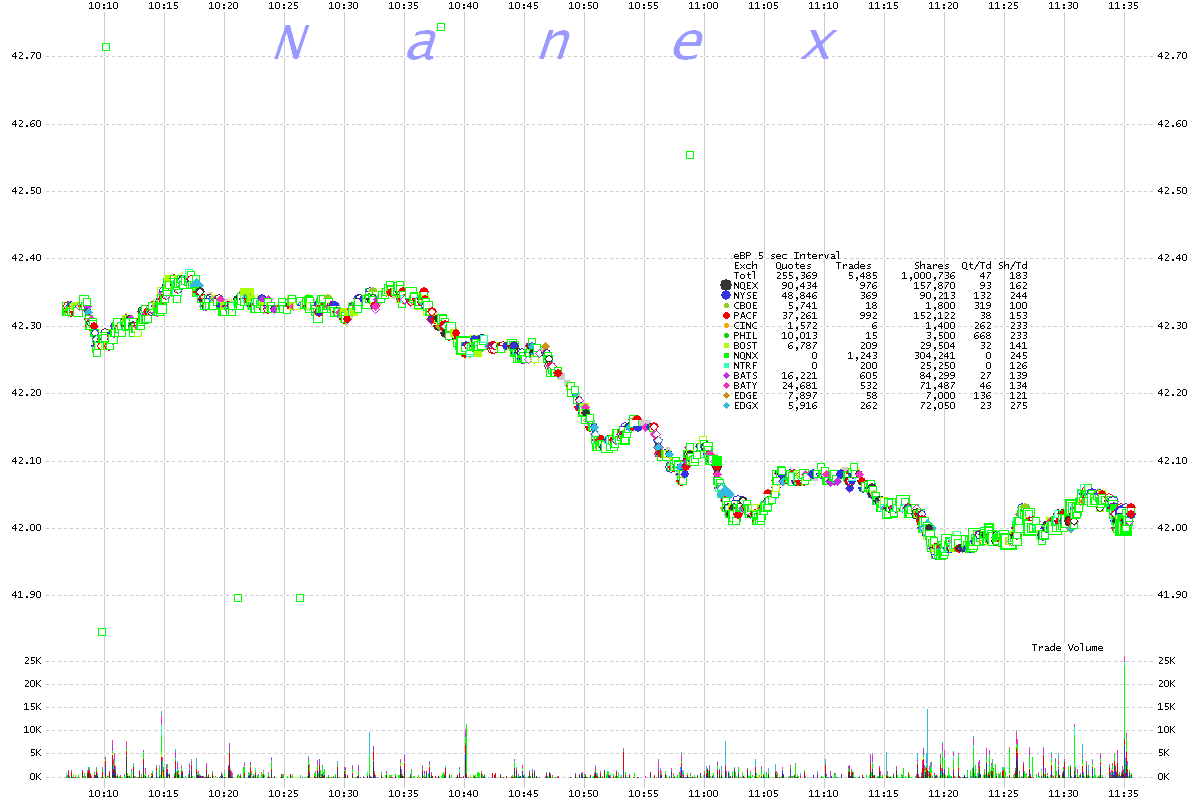
3. Same chart as above, but connecting trades to help you see the bad prints.
We now know that the price spikes near the top were from retail sell orders, and the spikes near the bottom were retail buy orders.
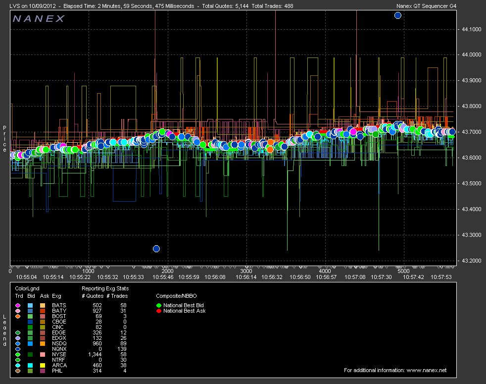
4. LVS Tick Chart
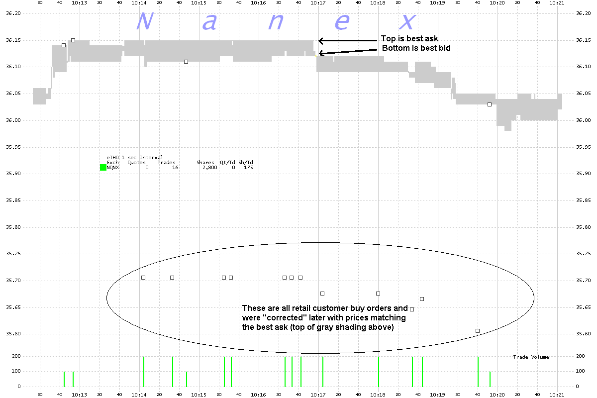
5. THO 1 second interval chart showing NSX (FINRA/Dark Pool trades) and the NBBO
Note how the bad trades track the NBBO.
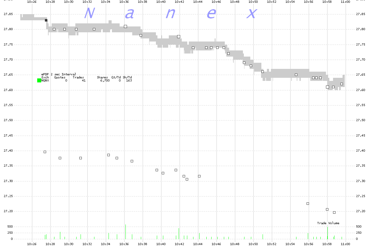
6. PDP 2 second interval chart showing NSX (FINRA/Dark Pool trades) and the NBBO
Note how the bad trades track the NBBO.